
Spring season is on its way. For many, it’s refreshing to come out and enjoy the warming weather. That means cozy spring vibes, bright hues, and exciting tones will prepare your interiors to welcome the blissful season.
Whatever your aesthetic is, these spring color schemes will be a hit for you.
1. Spring Forest and Gold
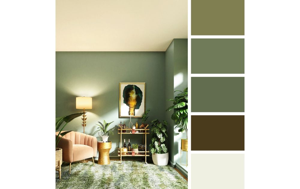
It’s not spring if there’s no green in this list. So, if you’re obsessed with plans and all things foliage, then this spring forest and gold palette will speak to your spirit. Turn your room into a haven for a spring goddess with gold details, fluffy green carpets, and a rich green wall color.
You can complete the look with access to natural lighting, a soft and plush designer chair, and mid-sized indoor plants. It’s a luxurious yet organic experience that leaves room for spring abundance and more.
2. Eggshell Blue and Caramel
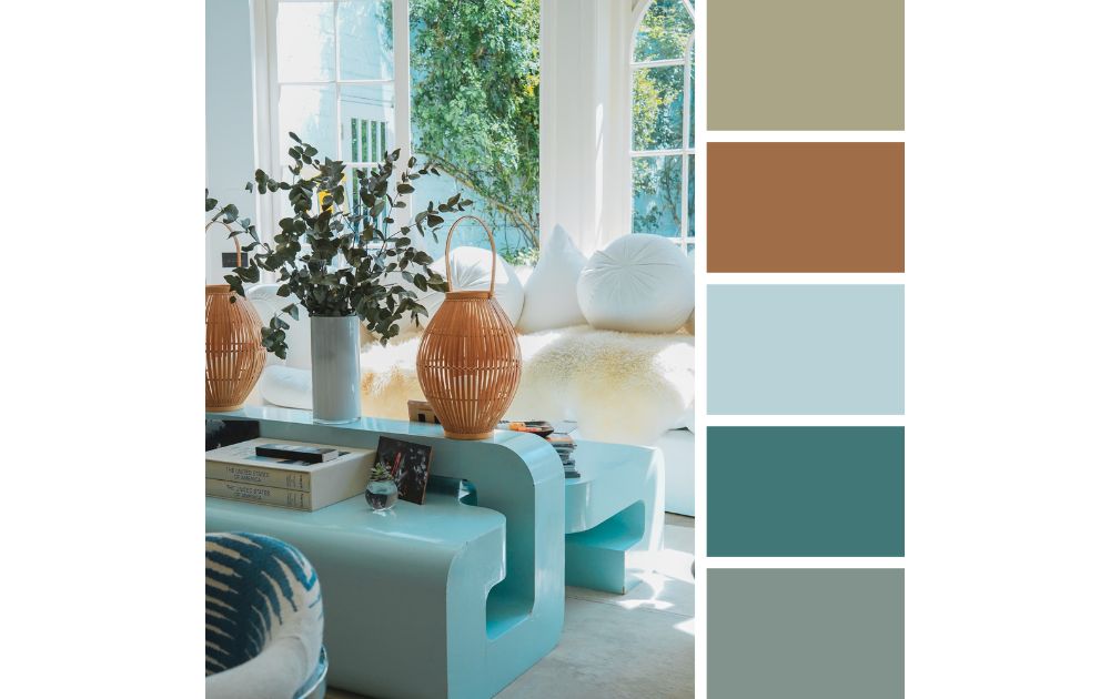
On the other hand, a soft eggshell blue can be pretty tricky to pull off, but it works with the right complementary colors. The trick is to use it on hero elements against a neutral background. In fact, this color works best with a caramel hue to bring out the contrast between the two colors.
Finish this design with a few long-stemmed ornamental plants, and you’ve captured the perfect springtime look.
3. Soft Rose and Neutrals
Spring is all about bright pops of color, and this soft rose and neutral palette is great for lovers of red. Leave the boring neutrals in the last season and bring your own twist by adding a rich and deep rose color.
Simply put, this is best used as an accent element. Because of this, you might want to get a bohemian carpet, as well as some red-colored pattern throw pillows and others. Finally, this color palette is best for rustic and homey interiors.
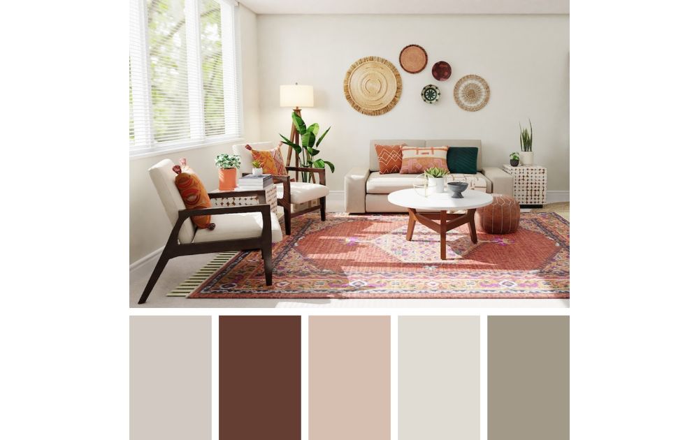
4. Muted Greens and Toffee
Meanwhile, this muted green color palette is for you if you want a more subtle spring look. Do you love green but don’t really want to commit to it? Pair it with a gray palette and some neutrals to create a little bit of design flexibility.
Plus, you can still retain that spring vibe with an earthly toffee hue in your wooden floor or lighting decor. This is great for people who want to dip their feet into seasonal interior design.
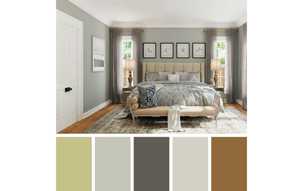
5. Darker Spring Hues
On the other hand, if you want something more mature and elegant springtime vibe, consider bringing dark spring hives to your home. Rather than emphasize the bright colors often associated with spring, this style capitalized on caramel tones and dark hues.
You can break apart this monotone palette by adding a greyish-green hue to still call back to springtime. Either way, this is a great choice for people who want to incorporate the spring vibe into their black and neutral interior.
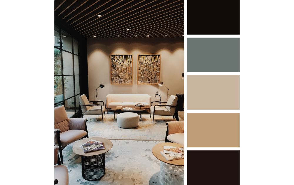
6. Luxe Tans and Grays
You can never go wrong with a luxurious color palette. This luxe tan and gray interior screams spring elegance in the best way. While this color story doesn’t have a bright or springtime vibe, it’s a good transitional theme from winter to spring.
Here, you can start adding more eye-catching elements like a structural chair and a center table. However, you can also play into the monochromatic look and pile on the gray decorative pieces. Either way, make sure you get the natural sunlight in to set up some brightness in this neutral space.
7. Pop of Color
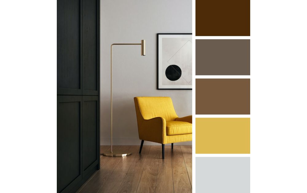
Want to go for the mid-century modern vibe? Then a pop of color is your way to the fleek street. Don’t be afraid to let your pop of color be a piece of furniture, a lamp, or a wall accessory. After all, when using bold colors like this against neutrals, the more eccentric the yellow piece is, the better.
Aside from this, you can pair this pop of color with a deep mahogany shade. At the same time, it also works well against an off-white wall background color.
8. Bohemian Neutrals and Lavender
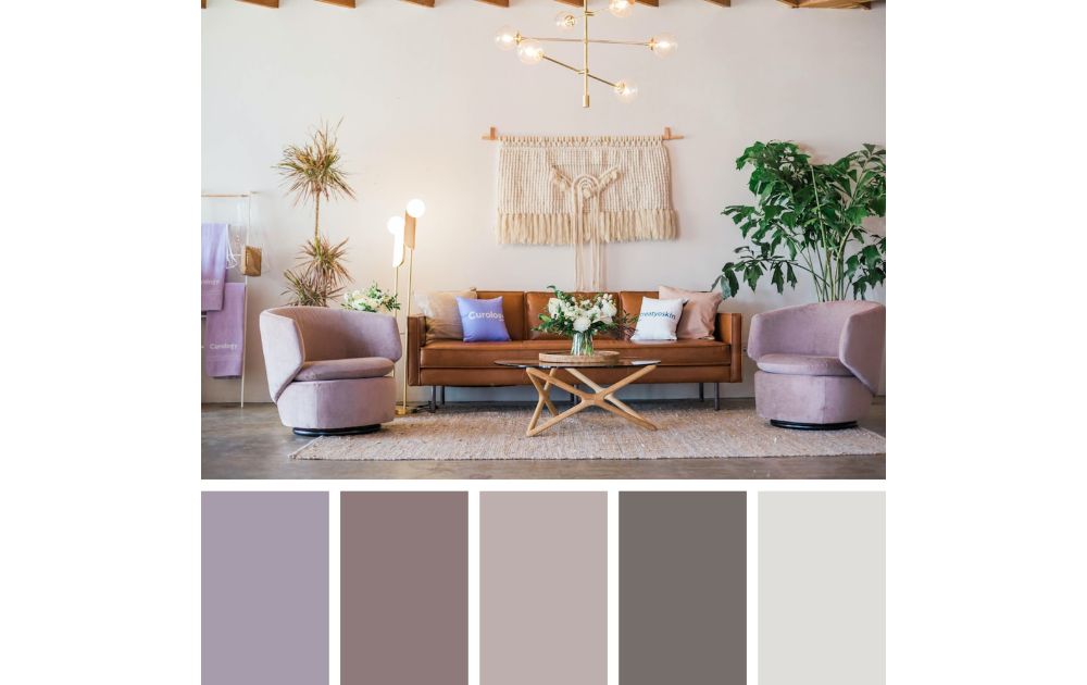
If you want to go for the trendy route, this is the way to go. In fact, muted tones are all in the rage this spring, and a soft and grayish lavender is a great way to introduce color to your simple room. With neutrals, you can add as many boho ornaments and thrifted finds as you’d like for a more eclectic feel.
Combine this with taupe shades, and you’ve got a great canvas to decorate with. Finish the look with some woven tapestry, modern lighting accessories, and big potted plants.
9. Bright Pink Tones
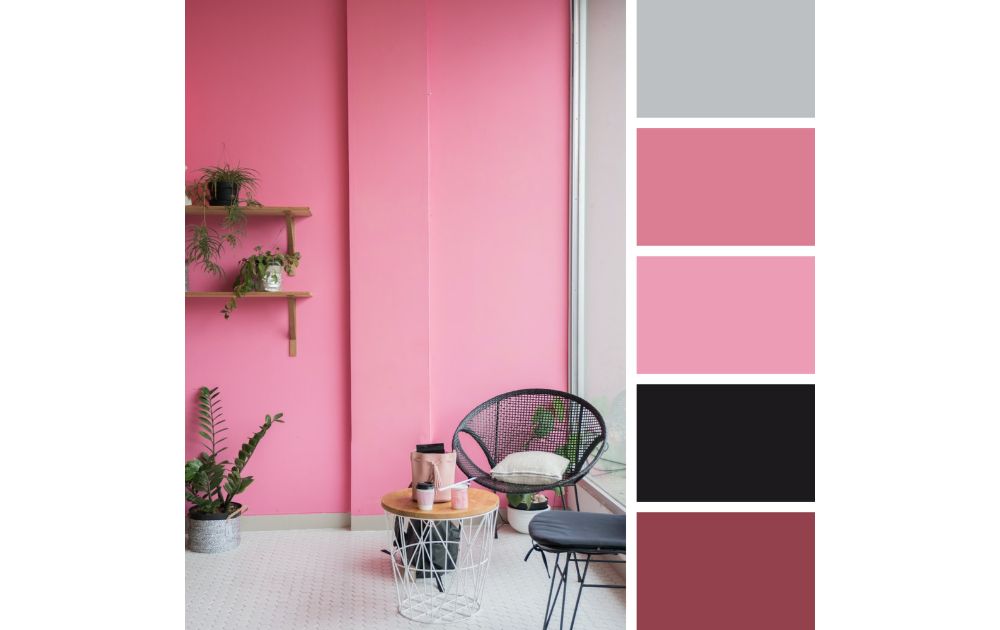
If there’s a color palette for trendy girls, it’s this black and pink story. Does hot pink intimidate you as a color? You don’t have to be hesitant anymore. After all, a bright pink tone works wonders when you pair it with a deep black and some neutral, complementary colors.
It’s best used as an accent color on walls, but you can add pink to your furniture, ornaments, and lighting fixtures. It’s the perfect color palette to welcome spring blooms.
10. Muted Blush and Earthy Hues
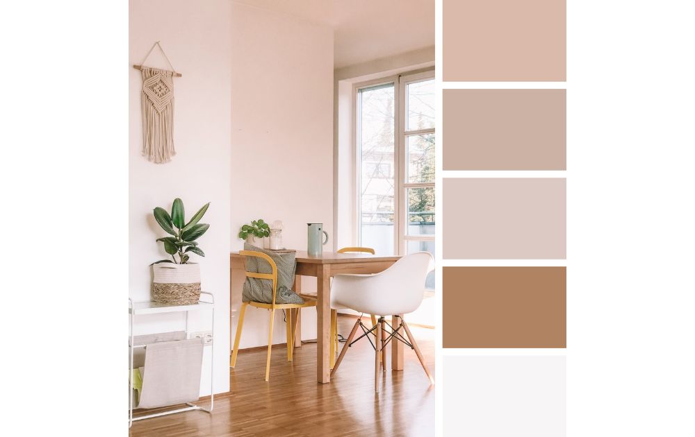
This color palette combination is the perfect alternative for people who want to put a twist on the minimalist revival. The muted blush hues are a great way to add a subtle shade to your room. On the other hand, the monochromatic color story also makes it an easy color story to design with.
Whether you’re going for a simple aesthetic or a boho beach vibe, this color palette can translate different aesthetics well. Plus, the pink and brown hue mix is easy on the eyes. Finally, it’s a simple and straightforward way to flex your style. You can add even add some ornamental plants for a pop of color.
There are many ways to go about designing your interior for springtime. One thing is for sure, though: we will see a shift to a brighter and greener aesthetic.
About the author
Carl Deña
Share story

